Digital Artifact – Post 3b
The Tech Drawer – Find the Right Tool for the Right Task
www.techdrawer.weebly.com
I believe that the words proceeding great scientific discoveries aren’t “EUREKA!” but “Hmmm… isn’t that interesting.” I feel like that describes by process with this digital artifact. I started out wanting to make tutorial videos and figure out how to sort and embed Twitter posts. In the end I did just that. However, I also ended up making a webpage and opening up several new projects to get onto once this course is done. Isn’t that usually how it goes.
Tutorial Videos
I definitely need to work on wrapping things up more quickly. The two that I made with Screencastify were about 9min long. They cover everything you need to know, but I’d like to aim for 5 min in the future. I supose that 9 min isn’t bad considering they’re from our Tech Ten sessions – 10 min long. Screencastify is easy to work with. I ended up paying for the year long subscription so that I could have more features, but it was a pretty reasonable price. It has a very basic editor, but frankly I really wasn’t looking for anything more sophistocated (or else I would have used my camera, green screen and Premier Pro… maybe next year)
Twitter Feeds
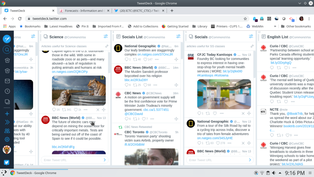
This was what I was really wanting to figure out during this course, and I’m glad I did. I learned a lot about using Twitter lists and collections. In the website for the different courses I have embedded either lists or collections. The lists are nice because they update themselves, but sometimes there is one account that posts more than the others, so it dominates the feed. I think I will probably make all of them just collections, but I’ve created lists for each course and set the list and collection for each subject next to each other in Tweetdeck so that I don’t have to drag them so far. What is really handy with Tweetdeck is that my TL partner and I can both use it, so it won’t be so onerous a task to update. We can also schedule tweets from our SLLC account, so we’re going to give that a shot. Should make it a little easier to get them out regularly and early enough in the morning that people can read them before the school day gets going.
Web Design Choices
I decided that if I was going to do a website, I should do a bit of research and get the design right – or at least attractive and practical. The website I liked the most that had some great tips was 27 Research-backed Web Design Tips… Yes, there really are 27 tips. Honestly, I was impressed with the information that this guy gives away (or maybe doesn’t give away – I think I have to sign up for the blog to get to that blog post any more). I also really appreciate why companies need to hire good website designers – not just to get the code right (I hear a lot about that at home from my partner who does network engineering), but there are many important aspects to visual design.
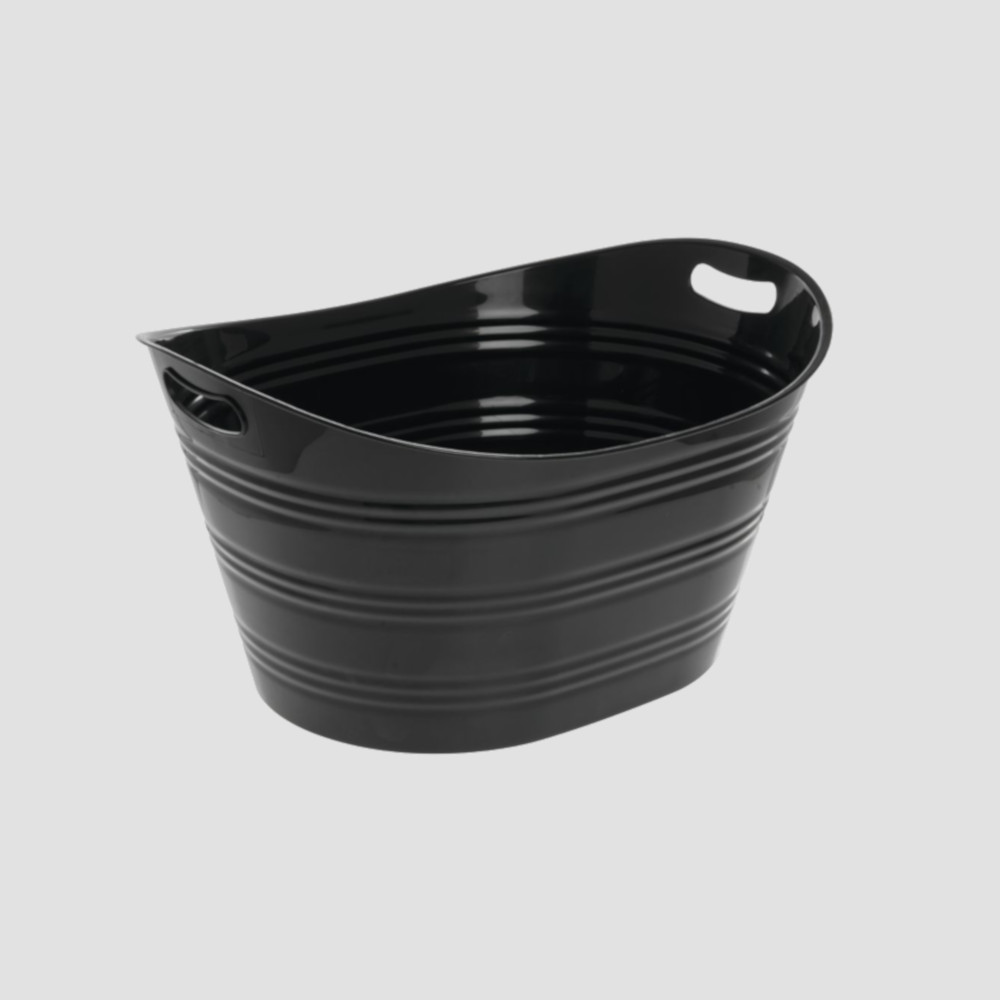
For instance, I spent 2 hours on a silly picture for my tab called Student Tech Tub. I got the background of the picture to match the other pictures, and then I realized the picture was the wrong colour, so it didn’t balance the weight of the black clock on the left. I was so happy when I got it right and my son said (in the wisdom of a 13 year old) “That looks dumb.” He was right though. I went the literal direction, and not for the visual description of what that tab is about.
Because I was using a Weebly template, a lot of the tips had already been taken care of. Here are the main tips I spent the most time with.
1) Visual Hierarchy,
2) Descriptive Phrase – what site is about,
15) Descriptive navigation – put most important items in the header
20) Write meaningful subheads
10) Use People Pictures – especially your people
11) is to avoid using stock photos of people
14) use colour to guide visitors’ attention
8) avoid carousels and rotating sliders – this drives me nuts with our new school district / school websites; stacking is better
19) avoid putting social media icons in the header – put them in the footer.
22) avoid jargon, use simple words
23) list order – important stuff at the beginning and end
24) answer visitors’ top questions – actually something really important to anticipate with this website so I could design it well
Oddly, #s 2, 15 & 20 were the ones that were the most obvious, and the most obviously missing. I made sure that I added short descriptions at the top of each page so people would know if they were in the right place. Keeping them short kept everything simple. That was another tip – use whitespace and keep things uncluttered. When I compare the new website to the current SLLC website, I can really feel the difference. I find our old site cluttered and too busy.
I also changed the hyperlink text from light grey to dark blue with green hover over – couldn’t see the light grey. Who thought that was a good idea? It goes along with tip #1 – using colour contrast helps to draw the eye to important items. I had added a Feature Article as part of the home page (frankly, it looked too sparse otherwise), and the article had a lot fo great links that were washed out with the original colour scheme. It made the article painful to read.
In the end…
I think I’m happy with the website so far. It has a skeletal feel to it because there is still so much to add for the courses and the student page. However, I think the structure of it works really well. I really also like all of the input I was able to get from my TL partner, teachers for different subjects, and students. In some cases it required more finicky organization for different courses (sometimes Weebly is a royal pain if you want a heading or divider just so), but I think the overall effect was worth the effort. The people using the website had a say in its design, so hopefully that will translate into better usage. It’s an obvious step – getting the input of the users, but one that so often we just don’t do, and one that I know I lament frequently. Only time will tell now how well all of this planning pays off.
Your story about the two hours spent on the tub only to be dismissed by your son really resonated with me and made me smile. This is definitely half the battle of technology is the formatting and design!
You’ve shared some really valuable tips here with web design and how to manage a Twitter feed. I’ve enjoyed interacting with you on our blogs and benefiting from your learning commons website. Hope we can keep in touch…maybe through Twitter? All the best!
Thanks! I’d love to keep in touch. You can certainly teach me via Twitter @dcbellsy or by email dbell@sd73.bc.ca. I’m going to keep the blog going, and maybe post my own stuff eventually on Twitter instead of just reposting. Baby steps!
haha I was also gonna comment on your two hours. I spent over 4 hours on the template design…and then probably another hour choosing 4 photos for my title page. I wish I had had access to those website tips, although I was so overwhelmed I probably wouldn’t have been able to put them to practice. I am very impressed with your website-it is really well laid out, not cluttered, and easy to navigate. Nice work! I’m also impressed you did so many different things. I was the opposite of you-I had big plans, and instead the website is the ONLY thing that I ended up doing. It took me FOREVER. I’d also like to stay in touch!
I definitely had a few moments where I wad tempted to throw a computer against the wall, especially because I had saved pictures to the desktops of three different computers, and of course the picture I needed was on the other computer!
I’d love to stay in touch. You can reach me via Twitter @dcbellsy or by email dbell@sd73.bc.ca.